Daniel Comboni
Comboni Missionaries
Institutional area
Other links
Newsletter
Wednesday, September 19, 2018
The participants at the Intercapitular Assembly in Rome on 12 September 2018 have approved the new “Logo” of the Comboni Missionaries. On this occasion it was also presented a guide for the use of the “Logo” (see attachment). The purpose of this manual, then, is to ensure the graphic convergence of the various renditions of the Comboni Missionaries brand name. A unified logo for the entire Institute is a solid sign of identity easy to recognize. For this reason it is important to observe some rules in order to maximize the efficiency of communications and to strengthen the personal character of our brand name.
The logo is born of a single idea reflecting the purpose of our existence as an institution within the Church and society. It represents the fusion of all that we are through a communication language of a graphic nature in a synthetic manner. It is meant to be the image of an attractive project we want to share. It is one of the fundamental elements of our visual identity in an impacting and immediate way. It acts as a visual sign demanding attention to and interest in what we represent. It describes the central idea of our mission and of our values.
Our mission
To promote and serve mission, namely the evangelization of the world, to give life and sustenance to a civilization and a culture of communion and of hope that will reflect a free, just, peaceful, brotherly society that respects Creation, the transcendent and inalienable dignity of the person and of the rights of peoples, especially the poorest and most abandoned.
Our values
Truth, freedom, justice, peace, rights and dignity of individuals and peoples, dialogue among cultures and religions, respect for all cultures, reconciliation, the beauty of life and creation, subsidiarity at all levels and networking.
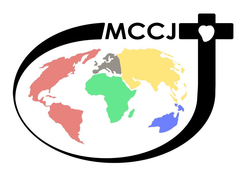
The logo, therefore, was born in an effort to synthetize our mission and our values in an element of graphic communication. So this is then the official version of the logo of the Comboni Missionaries of the Heart of Jesus (mccj):
The logo reproduces four principal elements, which reflect the Comboni spirituality, vision, mission and charism:
- The cross
- The world
- The name
- The heart
The logo has an elliptic shape that expresses dynamism. It is an open oval to communicate inclusion and the capacity to expand. The circular shape is also the symbol of the unity and fraternity within the Institute.
The colors of the continents are the same as those of the missionary rosary, with the exception of Europe for which brown was chosen in order to obtain a better chromatic uniformity. The different colors are also the expression of the internationality of the members of the Institute, a sign of vitality, evangelical dynamism and ability to adapt to the different realities of today’s world.
See the attachment for all the details.


